
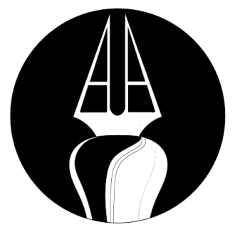
Our first assignment in Illustrator will be a personal logo. The logo shown here is successful on many levels. First off you know it’s the logo of an artist as you see the pen right way. The drawing is clean and graphic. The ink spill adds character. It works great in black-and-white, and since ink is indeed black, there’s another level there. Thirdly, the artist’s initials are AA, so there’s also an element of personalization.
When you are creating your logo think about the places you would display it. It should work across various platforms (social media sites, personal portfolios) and mediums (paper, web, apparel). It needs to read well printed small, as well as, large. It should work both in horizontal and vertical spaces. For all these reasons, we use Illustrator to build our logos as vectors.
We also need to think of logos in modern terms. Today logos work best as a system. We start with a base (specific colors, particular font), and then build up the brand with a fluid identity. Google is the best example of a brand with a successful logo system. See screenshot below to get an idea of how Google carries the main elements of its logo through its different iterations. Here’s more about Google’s evolving logo system design.
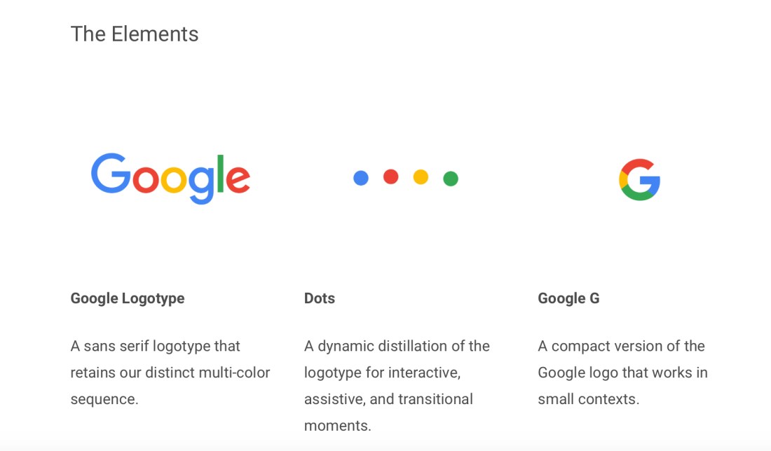
While I’m not expecting you to create a logo system for this assignment, I’d like you to think in terms of application. How could the logo you design be carried through into a system? What elements are key to your brand?
We will talk about color theory in class. Design your logo first in black-and-white, then take some time to really think about what color or colors you choose to include. We will talk about the physiological and subconscious effects of color. We will discuss and look at certain colors in themselves, as well as relationally. In your creative process, I’d like you to explain to me why and how you choose your logo colors. I highly recommend the book, “The Secret Lives of Color,” by Kassia St. Clair. I use many of her quotes in my color theory lecture.
I came across this interactive infographic about how logos have evolved. Each design period is characterized, and there are examples of the most effective logos of the period. Peruse the evolution, or skip to steps 11 and 12 to see what’s popular in the digital age.
Today logo design is going global with many companies looking for a more generic, universal style. In my opinion, too many ad campaigns in fashion magazines look the same. Houses like Burberry and Celine have ditched the extras – serifs and accent respectively – turning to the new norm: sans-serif, bold face, all caps, condensed. I’m sensing a serif comeback: stay tuned.
When designing your logo, keep in mind the trends, but push creativity. You’re an individual artist, not a global company. Your style should be reflected in your logo.
Here are some tips:
*What you want to portray about yourself — think 10 years ahead, where do you want to be? Find something representative of what you do or offer, maybe employ a metaphor.
*Design it in black-and-white first, then reverse colors; still effective?
*Once the basic shape/style is ready, add color.
*Does it work small, big? Test it.
*Ask someone if they like it? Ask them to draw it back for you; what do they remember
*How would you animate it? Get inspiration here: animated logos.
Read more about logo design:
Penguin’s logo redesign
The origins of Starbuck’s mermaid logo
See you Thursday!

