
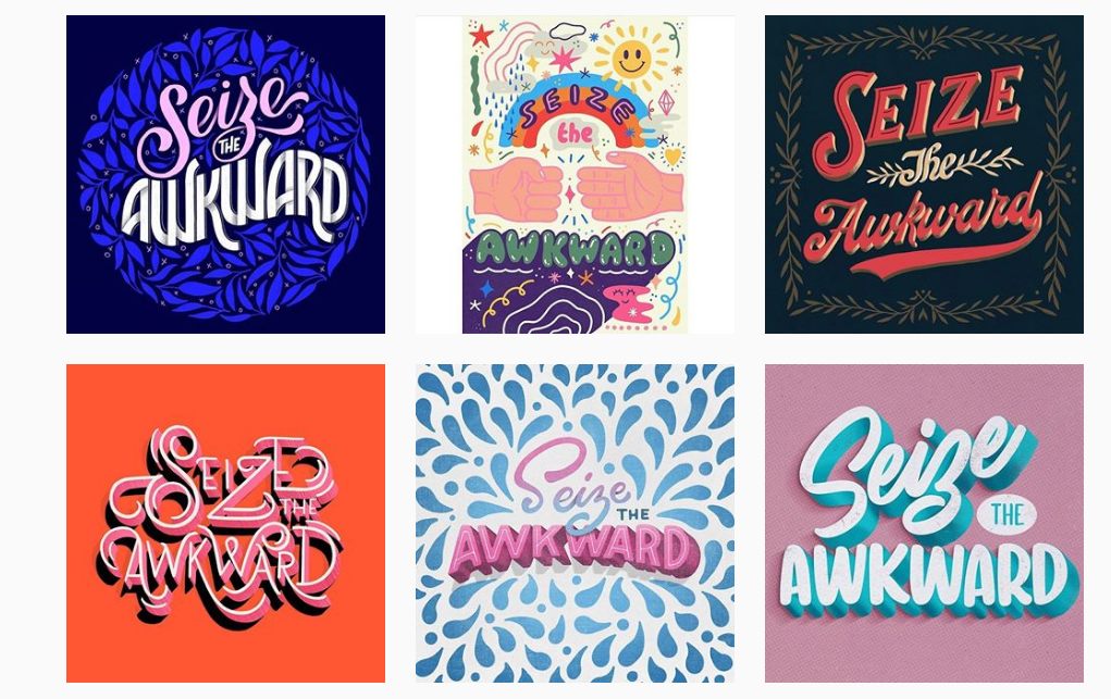
Typography is an integral part of print and web design. It is the technique — the art — of arranging type in a clear, thoughtful and engaging way. The display type works in tandem with illustrations and photography to create the mood of a piece and to tell the story.
Type is made out of characters, which are the letters, numerals, symbols and punctuation printed on a page. Character size, stroke weight and letter spacing all play a role in how the type is perceived by viewers. Designers and illustrators study and understand the power of type, and they use it purposefully to convey, reinforce or upset a message.
In page design, there is a hierarchy of type, or rather types of type. The first thing you notice about type on a page is its size. The big type like headers and titles is your display type. This is the type where designers often experiment with color, line thickness, space between characters, arrangement, etc. The smaller big type (decks, summaries or pull-quotes) can also be treated in a special way, for example the lines of the sentence(s) might have more space between them (leaded out), or they might be centered as opposed to left aligned. The smallest types like body copy, captions, and folios are usually formatted a particular way, following a master paragraph style.
In class we’ll look at different page designs to study and discuss the type arrangement. I’d like you to take what you learn in class about typography and apply it to your next assignment, the Mashup poster. For this poster, I’d like you to mashup the softwares Photoshop and Illustrator, combining vector and bitmap art. I’ll post the assignment doc on slack after we go over it in class.
We’ll also look at how to stylize type in Illustrator. From the many Illustrator effects, we’ll go over 3-D type, and how to transform basic fonts. Make sure to check out the Creative Cloud Typekit library, as new fonts are continually added. You can also search the companies who specialize in type (foundries), some offer free or reasonably priced fonts for download.
Responsive typography, more popular than ever as designers need to prototype information on various platforms, was recently added to Illustrator. We’ll take a look at how it works. Here is a good explanation if you’d like to learn more about variable fonts.
For inspiration on poster design, and different Creative Cloud workflows, check out this overview by Nigel French. And if you’re interested in learning how to create a hand-drawn type poster, here’s a great tutorial.
See you Thursday!

