InDesign Interactivity

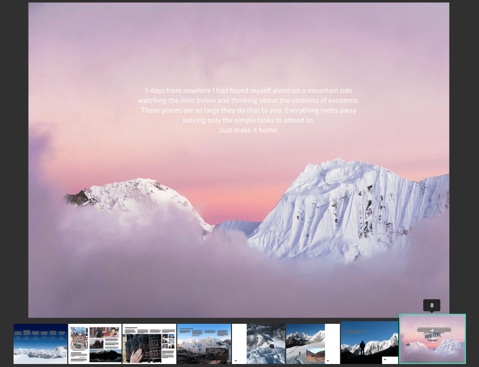
5daysfromnowhere
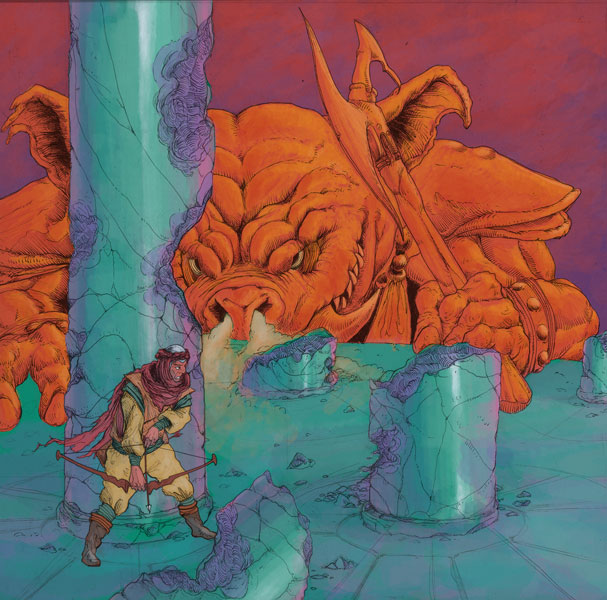
Screenshot taken from 5 Days from Nowhere, an interactive ebook example on Adobe.com

For our last class on InDesign, we’re going to explore the many ways to add interactivity to our zine projects. We’ll start out with a brief overview of the three types of interactive file types (Interactive PDFs, reflowable epubs and Fixed-Layout epubs). For this class we will be making a Fixed-Layout epub.

InDesign has a slew of panels dedicated to interactivity. We will have a close look at the Animation, Timing and Object States panels. The interactivity features allow adjustment to object appearance, motion, scaling and direction. You can also add in sound, slideshows and video.

Once you have designed your zine, save it out as a new indd file. Use this new file to add in interactivity. You may find that you need to redesign sections of your zine to support animation. It’s OK if you need to rearrange or drop pages to support your interactivity ideas. They don’t have to be identical books.

It would be great to see an interactive element on every page (Three animations required as a minimum). There can be recurring elements such as music, but I’ll be looking for creative use of InDesign’s animation panel. Look through 5 Days From Nowhere to get some animation ideas. 

Some ideas to get you started:
-Animate your logo
-Animate your headers
-Create a slideshow of interesting sketch ideas, in-progress illustrations, inspiration
-Animate the background of your illustration
-Link to your website and social media platforms
-Add music files to create ambience

Here’s a great InDesign resource with lots of helpful information and tutorials on animation.

Another thing that I’d like all of us to do in class is test print our zines. It’s important to follow the attached directions very specifically.

Here are the printing instructions: *InDesign print booklet

See you Thursday.
Intro to InDesign

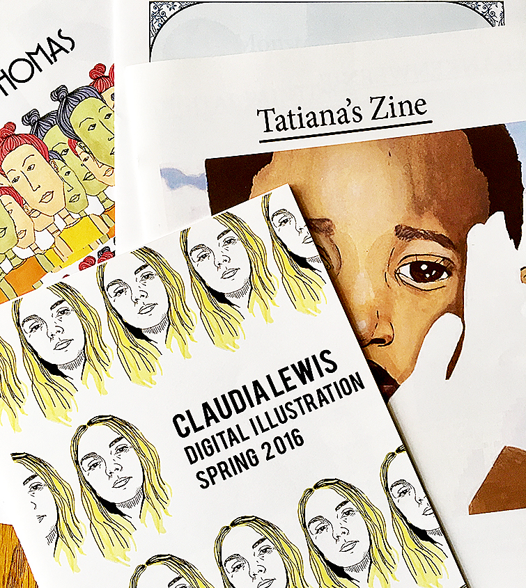
zineintro

InDesign is the go-to software for page design, particularly for multi-page documents. Compatible with Photoshop and Illustrator, it is easy to bring in and layout bitmap and vector art, alongside body copy, display type and other graphic elements. The art files are linked to the InDesign document, but reside outside of it, keeping down the weight of the file size. InDesign will print these files in their native formats, whether raster or vector.

We will use InDesign to produce our final project, a 12-page zine comprising of the semester’s work. Once the print version is complete, we will also create an ebook, adding in some interactivity (your GIF, your logo animated, maybe a slideshow or a music file).

This week we’ll work on setting up your zine pages and placing artwork and text. For next week’s class, I’d like to see five sketches for your cover art design. The cover counts as a separate 10 points. Think of the cover as a way to bring together the separate projects of the semester. How can you unify your work? How will it represent you?

Popular key commands:
command j: go to page #
command d: file/place
w: turns off frame edges
option + shift : copy and keep alignment of a frame
command +/- (zoom in/out)
command opt 0 (centers spread)
command 0 (centers page)
command 1, 2, 4 (100%, 200%, 400% respectively)

Website links:
InDesign specific tutorials, plus free templates for menus, books, brochures
Typefaces in action

Typography basics, Illustrator in-depth

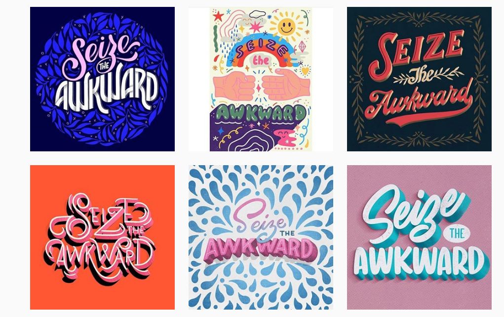
seizetheawkward
Typography challenge by Goodtype on Instagram.

Typography is an integral part of print and web design. It is the technique — the art — of arranging type in a clear, thoughtful and engaging way. The display type works in tandem with illustrations and photography to create the mood of a piece and to tell the story.

Type is made out of characters, which are the letters, numerals, symbols and punctuation printed on a page. Character size, stroke weight and letter spacing all play a role in how the type is perceived by viewers. Designers and illustrators study and understand the power of type, and they use it purposefully to convey, reinforce or upset a message.

In page design, there is a hierarchy of type, or rather types of type. The first thing you notice about type on a page is its size. The big type like headers and titles is your display type. This is the type where designers often experiment with color, line thickness, space between characters, arrangement, etc. The smaller big type (decks, summaries or pull-quotes) can also be treated in a special way, for example the lines of the sentence(s) might have more space between them (leaded out), or they might be centered as opposed to left aligned. The smallest types like body copy, captions, and folios are usually formatted a particular way, following a master paragraph style.

In class we’ll look at different page designs to study and discuss the type arrangement. I’d like you to take what you learn in class about typography and apply it to your next assignment, the Mashup poster. For this poster, I’d like you to mashup the softwares Photoshop and Illustrator, combining vector and bitmap art. I’ll post the assignment doc on slack after we go over it in class.

We’ll also look at how to stylize type in Illustrator. From the many Illustrator effects, we’ll go over 3-D type, and how to transform basic fonts. Make sure to check out the Creative Cloud Typekit library, as new fonts are continually added. You can also search the companies who specialize in type (foundries), some offer free or reasonably priced fonts for download.

Responsive typography, more popular than ever as designers need to prototype information on various platforms, was recently added to Illustrator. We’ll take a look at how it works. Here is a good explanation if you’d like to learn more about variable fonts. 

For inspiration on poster design, and different Creative Cloud workflows, check out this overview by Nigel French. And if you’re interested in learning how to create a hand-drawn type poster, here’s a great tutorial.

See you Thursday!

Map-making, Symbols, Patterns and Texture in Illustrator

maps2


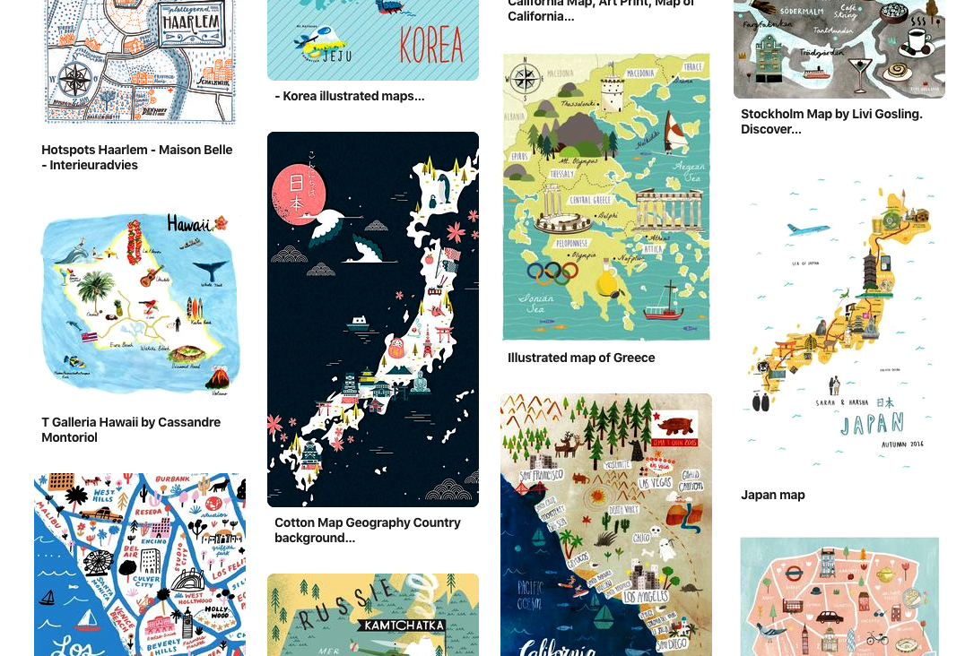
Maps are a visual representation of the “relative position of the parts of something,” often the location of a geographic area with its physical features, cities, streets, etc. Newspapers and magazines often use maps to illustrate the place mentioned in a news story or an editorial feature. A locator map is a simple version, just relevant towns, streets and buildings.

For our class, I’d like to focus on beautifully illustrated maps, which I have been seeing all over Pinterest, in magazines, books and online. These maps take time; they are pieces of art.

Here are a few artists who illustrate maps using their own unique styles, yet keep true to the vibes of each place: Josh Cochran, Rena Ortega, Nate Padavick.

Map design starts with research about the place, getting a feel for the region, its landmarks and people. How to best illustrate a place’s uniqueness? 

For our class assignment, pick a place you know well. It can be as big as country or as small as your neighborhood corner. Try to demonstrate the mood of the place using your own playful, creative sense of style.

Making a vector map is a good way to learn the ins-and-outs of Illustrator. You’ll practice working with multiple layers, text and image. You might want to make some symbols of items you use repeatedly like tree outlines or road signs. And how to add in some of that coveted texture? We’ll go over some tips for all these things in class.

Here are some tutorials you might want to check out:
The Joy of Illustrated Maps in an era of Google Earth
Maps in 3D
How to make a vector map

See you all on Thursday!

Logos, Color theory and vectors

artboard-1-100
Personal Logo, Fall 2017

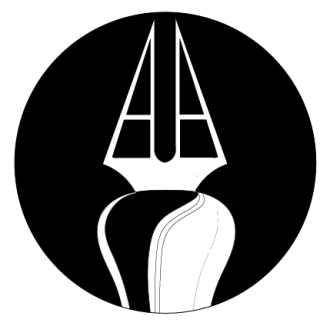
Our first assignment in Illustrator will be a personal logo. The logo shown here is successful on many levels. First off you know it’s the logo of an artist as you see the pen right way. The drawing is clean and graphic. The ink spill adds character. It works great in black-and-white, and since ink is indeed black, there’s another level there. Thirdly, the artist’s initials are AA, so there’s also an element of personalization. 

When you are creating your logo think about the places you would display it. It should work across various platforms (social media sites, personal portfolios) and mediums (paper, web, apparel). It needs to read well printed small, as well as, large. It should work both in horizontal and vertical spaces. For all these reasons, we use Illustrator to build our logos as vectors.

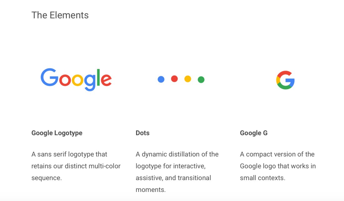
We also need to think of logos in modern terms. Today logos work best as a system. We start with a base (specific colors, particular font), and then build up the brand with a fluid identity. Google is the best example of a brand with a successful logo system. See screenshot below to get an idea of how Google carries the main elements of its logo through its different iterations. Here’s more about Google’s evolving logo system design.

LOGO SYSTEM elements

While I’m not expecting you to create a logo system for this assignment, I’d like you to think in terms of application. How could the logo you design be carried through into a system? What elements are key to your brand?

We will talk about color theory in class. Design your logo first in black-and-white, then take some time to really think about what color or colors you choose to include. We will talk about the physiological and subconscious effects of color. We will discuss and look at certain colors in themselves, as well as relationally. In your creative process, I’d like you to explain to me why and how you choose your logo colors. I highly recommend the book, “The Secret Lives of Color,” by Kassia St. Clair. I use many of her quotes in my color theory lecture.

I came across this interactive infographic about how logos have evolved. Each design period is characterized, and there are examples of the most effective logos of the period. Peruse the evolution, or skip to steps 11 and 12 to see what’s popular in the digital age.

Today logo design is going global with many companies looking for a more generic, universal style. In my opinion, too many ad campaigns in fashion magazines look the same. Houses like Burberry and Celine have ditched the extras – serifs and accent respectively – turning to the new norm: sans-serif, bold face, all caps, condensed. I’m sensing a serif comeback: stay tuned.

When designing your logo, keep in mind the trends, but push creativity. You’re an individual artist, not a global company. Your style should be reflected in your logo.

Here are some tips:
*What you want to portray about yourself — think 10 years ahead, where do you want to be? Find something representative of what you do or offer, maybe employ a metaphor.
*Design it in black-and-white first, then reverse colors; still effective?
*Once the basic shape/style is ready, add color.
*Does it work small, big? Test it.
*Ask someone if they like it? Ask them to draw it back for you; what do they remember
*How would you animate it? Get inspiration here: animated logos.

Read more about logo design:
Penguin’s logo redesign
The origins of  Starbuck’s mermaid logo

See you Thursday!

Introducing Illustrator

Designers and illustrators use the software Illustrator to create vector-based artwork. Simply put a vector is a mathematical object that has a certain size and direction, it can be made up of points, lines, curves and geometric shapes. Unlike art made out of pixels, vector art is resolution independent, which means that it can be sized up or down with no quality loss.

There are many times when it is necessary to have this resolution independence. One of the best examples being logo design. It is rare for a logo to be used one time at one size, solely on one platform. Logos need to be flexible. They need to work on websites, business cards, T-shirts, letterhead, etc. A logo needs to be easily resized, and look sharp in big type as well as small. A logo designed in Photoshop at a set size will only work for that instance, or smaller, so it’s limited in its use.

Another great use of vector art is for infographics (information graphics). Made out of imagery, text, charts and/or graphs, infographics explain complex information and/or data. The goal is quick comprehension, which often means simple graphics and minimal text.

Illustrator is also used to create photo-realistic objects, display text, and of course, illustrations.

In class, we will get to know Illustrator, comparing its drawing tools and work area to Photoshop. We’ll explore the numerous ways to create and modify objects, paying close attention to the layers (and sublayers) panel, as well as, color and gradients.

We will also begin to talk about type. Starting with the Type tool, we will explore: the difference between point type and area type, the character panel (kerning, tracking, scale, etc.) and the create outlines feature. In the coming weeks we will dive more deeply into typography, its terminology and its key role in design.

Here’s a few fun links:

Photoshop and Illustrator: a visual look at the differences 

80 best Illustrator tutorials on every topic / tool imaginable.

Up-and-coming illustrators compiled by Digital Arts Online UK

Drawing Vector Graphics Laboratory with Von Glitschka

Color, brushes, and painting in PS

Pig-Woking-file
Student work, Fall 2017

This week we will focus on how to use Photoshop to create textured, paint-like posters. We’ll welcome Steve Ellis, a comic book professional artist, to our class and watch as he demonstrates his learned painting techniques. Get yourselves acquainted with his work, consider what questions you might have for him, and introduce yourselves. He may have some advice on which sketch to pursue for your digital painting assignment. He teaches an in-depth digital painting class here at the VPA school, so keep that in mind if you find yourself wanting to know more.

Before Steve’s demo, we will briefly go over color in PS, brushes and their settings, and then circle back to an explanation of smart objects. I will plan on staying for office hours after class if anyone would like to discuss the animation project.

The digital painting assignment is due Feb. 21. I will upload the assignment document to Slack. Remember no class Feb. 14, as I will be in Alaska skiing.

Here are some digital painting tips:
* Start with a strong sketch. Is there good composition/clear focus? Solid linework?
* Use big strokes at the beginning of painting to block out shapes and define shading. Finish by cleaning up with small strokes. Use simple brushes the majority of the time, use fancier brushes less often for more effect.
* Remember the importance of contrast! A contrast of value (a color’s relative lightness/darkness) makes objects to appear separate. Check how your painting looks in black-and-white.
*Don’t get lost in the details. Periodically take a step back, and ask if this or that detail is important.
* Play with color relations. What color is nearby another affects the other color’s warmth/coolness. Use color to your advantage. Add in white sparsely to pull out an area.
*Add in texture selectively. If texture is everywhere, it may be overwhelming. Decide where you want the focus to be. Crisp lines and details = focus; Soft edges = recession.

Some great Lynda.com tutorials on digital painting:
* How to customize PS brushes.
* Natural media painting features.
* Become a digital painter.

See you tomorrow at 8:30am!

Photoshop Animation

robo2
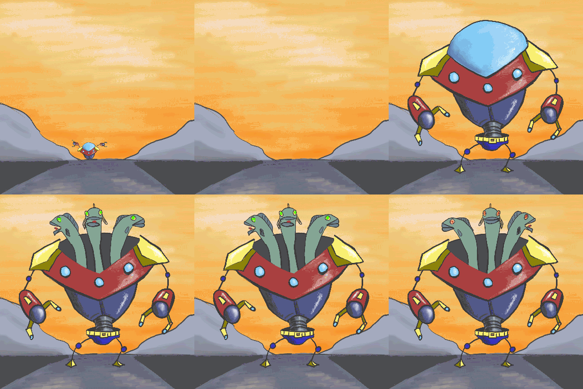
Student work, Fall 2018

Animated GIFs have been around for decades. They’re easy to load, fun to watch, and even more fun to share. GIFs are popular on websites like Tumblr, Facebook and Reddit; plus there are many sites devoted solely to GIFs like Giphy, Tenor and Imgur.

Photoshop makes animation easy. We’ll use the timeline panel to create a basic frame animation.

Then we’ll move onto layer animation using the video timeline. We’ll learn about keyframes, tweening, adding in layer adjustments, texture and background details.

Read more about why the silent mini videos are so popular as a means of digital expression. And just for fun, here’s life explained by GIF.

Tutorials to check out:
How to make a cinemagraph
Start with real stuff, then animate it
Time-lapse animation

Homework: Animate a bunch of drawings; upload the best one, or a few, to Slack.

Next class, Feb. 7, Steve Ellis, a well known comic book artist and illustrator, will teach you the art of digital painting. Bring some sketch ideas for the digital painting assignment, and get Steve’s input!

See you tomorrow!

Masking, Blending and Shapes

frank_studenteg72
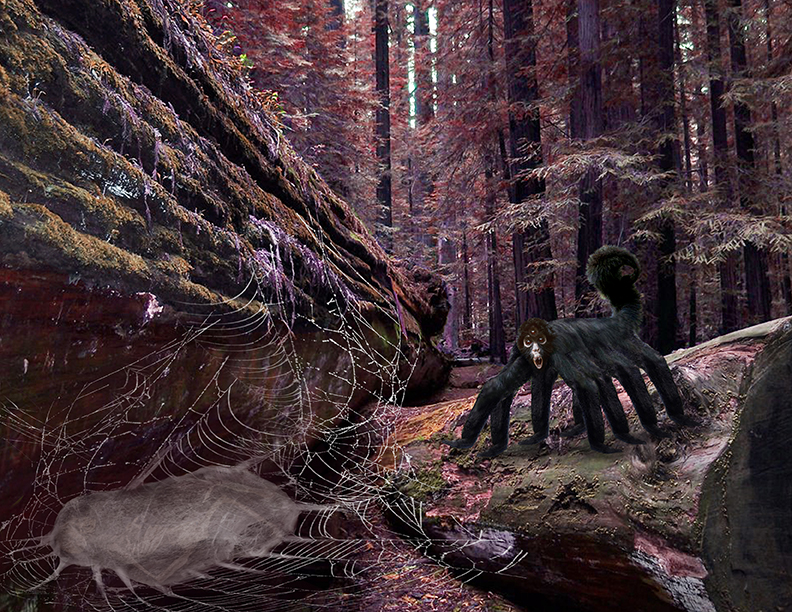
Digital composite example

Last week we began our exploration of Photoshop (PS). We talked about display resolution versus image resolution, the importance of high resolution images for print and how to check a photograph’s resolution.

We learned how to bring images into PS, how to do basic adjustments, how to navigate the menus and toolbar. We also talked about the different types of layers, how to organize with folders, and be tidy as we work.

We touched on gradients, color range and channels.

This week we will be working with our photos to create a digital composite. The first thing we will go over is how to bring in sketches to work with digitally. Then we will learn three different ways to silhouette or “mask” images from their backgrounds. We will practice the pen tool, to master the technique of efficiently hiding complicated backgrounds. I will talk a lot about the importance of a non-destructive workflow, and saving a work path in the Paths panel.. We will learn how to use the select and mask taskspace to mask out tricky hair and fur for a more natural look.

We will also take a look at how to blend the images together, and make them fit into their environment. We will get into blending modes, and finish up with creating shapes.

Things to remember:

— Masking does not mean erasing the background. We are hiding the background. We want to have the ability to go back to the original file. Sometimes you will need to readjust your image, adding back in some of the item silhouetted. A mask can always be adjusted with the direct selection tool.

— A work path needs to be saved. This is a necessary step, especially later when we bring silhouetted images into InDesign.

Here’s a great tutorial on the select and mask feature. And for pen tool practice, check out this fun game.

See you Thursday!

Welcome to Digital Illustration

downtown2ben
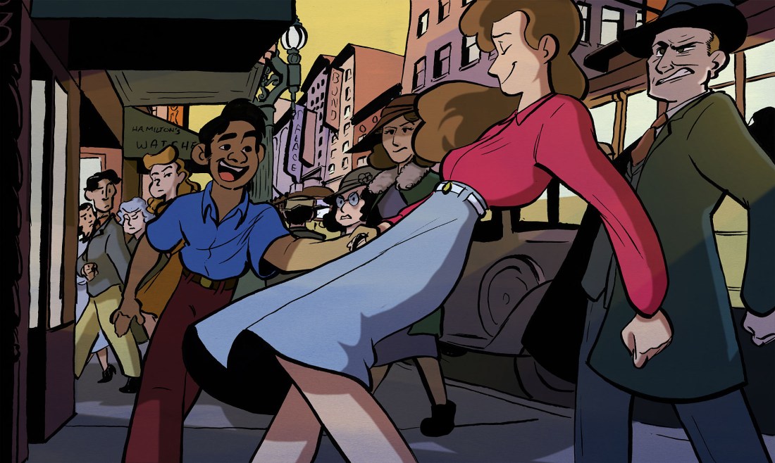
Digital Painting assignment, Fall 2016

The intent of this course is to familiarize you with the logistic and creative power of the Adobe Creative Suite, an industry standard. Contemporary illustrators and designers rely on the software immensely, to adjust colors or digitally paint scanned artwork; to draw and edit vector graphics; to layout completed illustrations for print or online publication. With digital art, the freedom to experiment is endless. Get ready to have fun with it!

The first four classes of the course are dedicated to Adobe Photoshop CC — a pixel-based, image-editing software. We’ll begin with the basics, namely how to:

  • Create and properly save files
  • Review digital file types
  • Locate necessary tools
  • Make adjustments to images
  • Organize workspaces and layers
  • How to search for images

After a bit of Photoshop exploration, we’ll experiment with animal photographs, manipulating and combining two or more photos into one image, creating our own hybrid monsters (who doesn’t like to make chimeras?). This work will prep us for our first project, a digital composite.